SVI Infographics and Choropleth Map
SVI, years 2010 and 2020, USA national and Mountain Division rankings
Trends
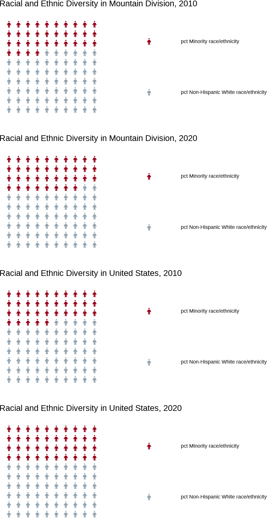
The Mountain Division social vulnerability indicators follow in general the same trends as those in the United States. Compared to 2010, 2020 saw improvements in most areas. There was a reduction of the percentages in poverty, unemployed, and housing cost- burdened. The percentage of those with a high school diploma, and thouse with health insurance increased. The population in general appear to be aging, with a larger share of the 65+ population. Together with an increase in the percentage of minorities, there is also an increase in the percentage with English proficiency. There was no notable change in housing type indicators, such as the distribution between multi-unit, mobile, and other housing, as well as the percentages living in crowded and group living quarters.
Infographics
Socieconomic Status Infographics
The Mountain Division social vulnerability indicators follow in general the same trends as those in the United States. Compared to 2010, 2020 saw improvements in most areas contemplated in the SES indicators. There was a reduction of the percentages in poverty, unemployed, and housing cost- burdened. The percentage of those with a high school diploma, and those with health insurance increased.

Household Characteristics Infographics
The household characteristics trends in the Mountain Division follow closely the national ones. The population in general appear to be aging, with a larger share of the 65+ population, especially in the Mountain Division. There seems to be an slight reduction of the single parent families.

Racial and Ethnic Minority Status Infographics
It is notable that, contrary to what may be popular beliefs, while there was an increase in the percentage of minorities, there is also an increase in the percentage of persons with English proficiency.

Housing Type and Transportation Infographics
Some improvement can be seen in transportation from the year 2010 to
- There was no notable change in housing type indicators, such as the distribution between multi-unit, mobile, and other housing, as well as the percentages living in crowded and group living quarters.

Chloropleth Maps
2010 SVI Flag to Population Ratio Map - Mountain Division
When county vulnerability flags are presented as a the ratio between the total SVI flags in the county and the county population, the overall vulnerability of the Mountain Division states seem to change. The state of Wyoming and Utah now appear to have the fewest counties with a highest vulnerability. Laramie County, which was ranked as one of the counties with the largest number of highly vulnerable tracks, now is ranked with an SVI as low as in the 20% quintile. All the counties in the southern states of the division, Nevada, Arizona, and New Mexico, appear at the 40 % quintile of vulnerability or higher.
2020 SVI Flag to Population Ratio Map - Mountain Division
At first sight, the vulnerability index in New Mexico appears to have worsened, while Arizona may have improved. Overall, there is not much change between the 2010 and 2020.