SVI Infographics and Choropleth Map
Data
The SVI data shows a few notable trends.
- Fewer households were cost-burden in 2020 than in 2010, but the rate is higher for the Pacific Division than the nation.
- Educational attainment improved from 2010 to 2020 with more people earning a high school diploma or GED equivalence.
- More people had health insurance in 2020 than in 2010.
- Age distribution has shifted in the Pacific Division and nation, reflecting the “silver/gray tsunami” or age wave. Baby boomers (born 1946-1964) were the largest generation in the U.S. until recently, but they still comprise a significant proportion of the population. The distribution of people aged 65 and older is expected to grow through 2030, by which point all baby boomers will have reached at least 65 years of age. Read more about this from the U.S. Census Bureau.
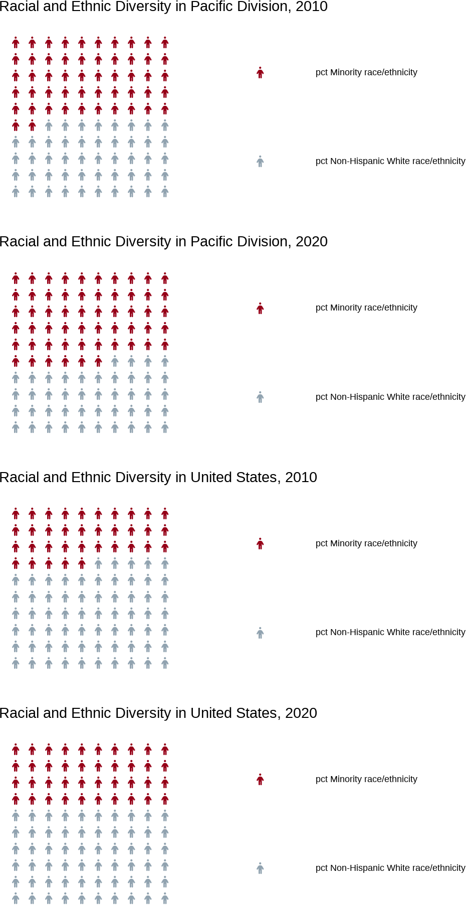
- Diversity increased over time for both the Pacific Division and nation. The Pacific Division is substantially more diverse than the nation.
- More people in the Pacific Division live in crowded living spaces compared to the nation.
| division | year | pct in poverty | pct not in poverty | pct unemployed | pct employed | pct housing cost-burdened | pct not housing cost-burdened | pct adults without high school diploma | pct adults with high school diploma | pct age 17 & under | pct age 18-64 | pct age 65+ | pct single parent families | pct other families | pct limited English speakers | pct proficient English speakers | pct Minority race/ethnicity | pct Non-Hispanic White race/ethnicity | pct in multi-unit housing | pct in mobile housing | pct in other housing | pct in crowded living spaces | pct in non-crowded living spaces | pct with no vehicle access | pct with vehicle access | pct in group living quarters | pct not in group living quarters | pct without health insurance | pct with health insurance | pct disabled civilians | pct not disabled civilians |
|---|---|---|---|---|---|---|---|---|---|---|---|---|---|---|---|---|---|---|---|---|---|---|---|---|---|---|---|---|---|---|---|
| United States | 2010 | 23 | 77 | 8 | 92 | 36 | 64 | 15 | 85 | 24 | 63 | 13 | 17 | 83 | 5 | 95 | 35 | 65 | 13 | 7 | 80 | 3 | 97 | 9 | 91 | 3 | 97 | 15 | 85 | 15 | 85 |
| Pacific Division | 2010 | 23 | 77 | 9 | 91 | 45 | 55 | 17 | 83 | 25 | 64 | 11 | 17 | 83 | 9 | 91 | 52 | 48 | 16 | 5 | 79 | 7 | 93 | 7 | 93 | 2 | 98 | 17 | 83 | 13 | 87 |
| United States | 2020 | 21 | 79 | 5 | 95 | 30 | 70 | 11 | 89 | 22 | 62 | 16 | 16 | 84 | 4 | 96 | 40 | 60 | 14 | 6 | 80 | 3 | 97 | 8 | 92 | 2 | 98 | 9 | 91 | 15 | 85 |
| Pacific Division | 2020 | 20 | 80 | 6 | 94 | 38 | 62 | 14 | 86 | 22 | 63 | 15 | 15 | 85 | 8 | 92 | 56 | 44 | 17 | 4 | 79 | 7 | 93 | 7 | 93 | 2 | 98 | 7 | 93 | 14 | 86 |
Socioeconomic Status Infographics
The Household Characteristics infographics introduce key data about poverty and near poverty, unemployment, housing cost-burden, educational attainment, and health insurance for the Pacific Division and nation.

Household Characteristics Infographics
The Household Characteristics infographics introduce key data about age distribution, disability status, family types, and English language proficiency for the Pacific Division and nation.

Racial and Ethnic Minority Status Infographics
The Racial and Ethnic Minority Status infographics introduce key data about racial and ethnic diversity for the Pacific Division and nation.

Housing Type and Transportation Infographics
The Housing Type and Transportation infographics introduce key data about housing types, crowding status, vehicle access, and group quarters for the Pacific Division and nation.

2010 SVI Flag to Population Ratio Map
This map shows the 2010 SVI flag-to-population ratio by county in the Pacific Division. Alaska had the densest concentration of counties with high ratios. Yakutat City and Borough flag growth outpaced the Yukon-Koyukuk Census Area, taking over the #1 spot in the division with almost 8.4 flags per 1,000 people.
Keep in mind that the flag data is aggregated at the county level and may mask or even reverse trends at the tract level.
2020 SVI Flag to Population Ratio Map
This map shows the 2010 SVI flag-to-population ratio by county in the Pacific Division. Alaska still had the densest concentration of counties with high ratios. The Yukon-Koyukuk Census Area had roughly 6 flags per 1,000 people, ranking highest in the division.
Keep in mind that the flag data is aggregated at the county level and may mask or even reverse trends at the tract level.