SVI Infographics and Choropleth Map
Data
From 2010 to 2020, both the United States and the West North Central Division experienced improvements in socioeconomic conditions. Poverty and unemployment rates declined, while educational attainment and employment increased. The West North Central Division consistently outperformed national averages across key indicators; showing lower poverty, higher employment, fewer housing cost burdens, and a lower percentage of adults without a high school diploma. These trends suggest growing economic stability and improved living conditions in the region over the decade.
| division | year | pct in poverty | pct not in poverty | pct unemployed | pct employed | pct housing cost-burdened | pct not housing cost-burdened | pct adults without high school diploma | pct adults with high school diploma | pct age 17 & under | pct age 18-64 | pct age 65+ | pct single parent families | pct other families | pct limited English speakers | pct proficient English speakers | pct Minority race/ethnicity | pct Non-Hispanic White race/ethnicity | pct in multi-unit housing | pct in mobile housing | pct in other housing | pct in crowded living spaces | pct in non-crowded living spaces | pct with no vehicle access | pct with vehicle access | pct in group living quarters | pct not in group living quarters | pct without health insurance | pct with health insurance | pct disabled civilians | pct not disabled civilians |
|---|---|---|---|---|---|---|---|---|---|---|---|---|---|---|---|---|---|---|---|---|---|---|---|---|---|---|---|---|---|---|---|
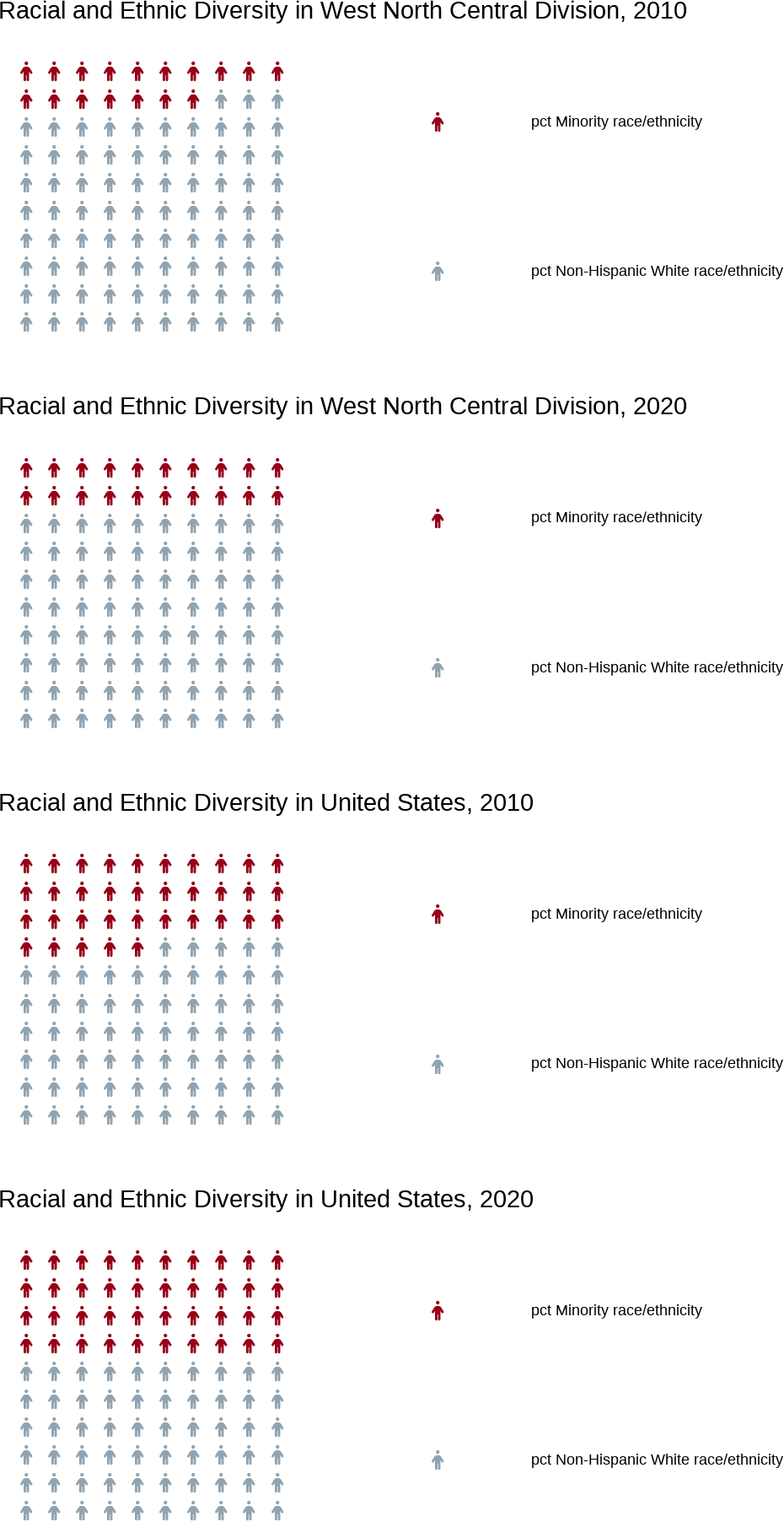
| United States | 2010 | 23 | 77 | 8 | 92 | 36 | 64 | 15 | 85 | 24 | 63 | 13 | 17 | 83 | 5 | 95 | 35 | 65 | 13 | 7 | 80 | 3 | 97 | 9 | 91 | 3 | 97 | 15 | 85 | 15 | 85 |
| West North Central Division | 2010 | 21 | 79 | 6 | 94 | 29 | 71 | 11 | 89 | 24 | 62 | 14 | 15 | 85 | 2 | 98 | 17 | 83 | 10 | 5 | 85 | 2 | 98 | 6 | 94 | 3 | 97 | 11 | 89 | 14 | 86 |
| United States | 2020 | 21 | 79 | 5 | 95 | 30 | 70 | 11 | 89 | 22 | 62 | 16 | 16 | 84 | 4 | 96 | 40 | 60 | 14 | 6 | 80 | 3 | 97 | 8 | 92 | 2 | 98 | 9 | 91 | 15 | 85 |
| West North Central Division | 2020 | 19 | 81 | 4 | 96 | 24 | 76 | 8 | 92 | 23 | 61 | 16 | 15 | 85 | 2 | 98 | 20 | 80 | 11 | 5 | 84 | 2 | 98 | 6 | 94 | 3 | 97 | 7 | 93 | 15 | 85 |
Socieconomic Status Infographics
The infographic highlights the region’s relative strength in employment and education. With a high employment rate of 96% and a low poverty rate of 19% in 2020, the division shows clear signs of economic resilience. Additionally, the decrease in housing cost burden and the increase in high school completion rates suggest sustained improvement in quality of life across the decade.

Household Characteristics Infographics
Household trends remain stable, with the largest share of the population falling in the working-age group (18–64). Single-parent families held steady at 15%, and older adults (65+) grew slightly from 14% to 16%. This indicates both demographic aging and continued support for traditional family structures. Group living quarters remained low (3%), pointing to predominantly private housing arrangements.

Racial and Ethnic Minority Status Infographics
Between 2010 and 2020, the percentage of minority populations in the division increased from 17% to 20%. Despite this growth, the region remains predominantly Non-Hispanic White. Limited English proficiency is very low (just 2%), which indicates a largely English-speaking population. The slow but steady diversification suggests gradual demographic change within a still relatively homogenous area.

Housing Type and Transportation Infographics
Most residents live in single-family housing with reliable vehicle access (94%). Mobile housing and crowded living conditions are minimal, showing a low level of residential instability. The high rate of vehicle access reinforces the region’s car-dependent infrastructure, while the lack of crowding suggests relatively spacious and stable housing environments.

## [1] "IA" "KS" "MN" "MO" "NE" "ND" "SD"

## [1] "19" "20" "27" "29" "31" "38" "46"
2010 SVI Flag to Population Ratio Map
The 2010 map shows that most of the West North Central Division had low SVI flag-to-population ratios, indicating that socially vulnerable populations were less concentrated. Only a few counties displayed higher relative vulnerability, suggesting that in 2010, the region overall had lower social risk levels compared to other areas.
2020 SVI Flag to Population Ratio Map
By 2020, subtle shifts appeared in the distribution of social vulnerability across the division. Some counties displayed increased flag-to-population ratios, potentially reflecting localized changes in housing affordability, minority populations, or other stress indicators. While vulnerability remained lower than in many parts of the U.S., the map reveals early signs of increasing disparity in specific communities.